The Pros and Cons of Apple’s iOS 7
Perhaps getting a jump on the upcoming Windows 8 upgrade due in mid-October, Apple released its 7th generation mobile operating system in September. The new iOS 7 has been extensively reviewed across the web — mostly positively — but I’d like to get in my two bits and note a couple of things I do and I don’t like about the upgrade.

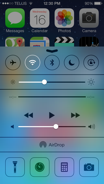
Perhaps the most useful feature I have used so far is the new Control Panel. A swipe up from the bottom of any screen — even in Lock mode — accesses the new panel. Depending on the device, the Control Panel allows you to change between Airplane Mode, Wi-Fi and Do Not Disturb modes, turn Bluetooth and Orientation lock on or off, Adjust volume and brightness, plus have access to a few useful Apps: a new Apple flashlight, a timer/stopwatch/alarm clock and world clock, a calculator and the camera. All in all, though there are some drawbacks with this kind of quick access from your Lock screen (which I’ll talk come back to), this addition is worth the upgrade in itself.
Another great feature is the newly improved Spotlight feature. Spotlight is Apple’s fancy name for a search function in which users can search their contacts, apps and more. So what’s new? Previously you had to scroll back past all your icon screens and your home screen to find this function. Now you can swipe with a downward motion from almost anywhere on any screen to access Spotlight. The only complaint I have (and it is a small one) is that you now have to be careful when swiping left or right to make sure your swipe doesn’t have any downward motion or Spotlight will appear. Also, be sure not to start your downward swipe too close to the top of your screen: if you pull down from too close to the top you get the new Notifications screen (including date, Calendar events, Weather, Stocks, etc.) which can also be a bit annoying.
A third change I really like is the way the folders now work. A folder is no longer limited to a single page of icons. Instead you can have whole pages of icons in a folder. You just swipe between them as you would any regular page, which makes for fewer pages and folders. A small complaint, though: I think Apple could have offered more icons per page on the iPad version of iOS 7.
The last feature I would like to talk about is the new look and sounds provided in iOS 7. Apple has really gone out of their way to give us some amazing backgrounds (which now include a “parallax” effect, whereby twisting and turning your device shifts the background, making it look like you’re peering into a 3D world), icons, ringtones and sound effects in their new operating system (as well, of course, the old ringtones for those feeling a little nostalgic). These are all cosmetics, of course, and not really functional but Apple is peerless when it comes to cosmetics and their emphasis and attention to detail encourages a truly immersive experience with your iDevice. My only minor criticism with the new look-and-feel is that the icons on the iPhone have been enlarged. While they are perhaps a bit clearer, they now take up more of the screen which means those beautiful new background images can be pretty well meaningless.
Okay, enough strokes for Apple over this admittedly incredible operating system. Time to cover a couple of things I don’t particularly like. The first of these are the concerns I have over security . As I mentioned above, the new Control Panel is accessible even from your Lock screen. As of this writing there have already been two compromises found through this access which allows unauthorized entry to parts of your iDevice. Apple has fixed one of the holes already with a security update, but the same day a new vulnerability was found. So while Apple has all provided these great features you can access from your Lock screen, security conscious users will want to disable them, fearing unauthorized entry if they lose their device.
The other issue I take with iOS 7 is the default email app. I have been using iOS since version 3 for my first iPhone 3GS. Apple keeps changing the look and some of the functionality of their Mail app but I really think they need to rethink the whole application. There are way too many flaws to get into here but, while the new App might look nice, they really have not addressed much in the way Mail works. I’m hopeful that iOS 8 will see a new and improved Mail, but like I said, I’ve been looking for those improvements since iOS3 so I won’t hold my breath.
I’ve laid out some of the key pros and cons I have found in Apple’s new iOS 7. It is a definite improvement over 6 (considering, that Apple noted a 60+% adoption of the new operating system one week after its release I’d say most agree) though I still think there are lots of areas with room for improvement.
Next month, if Microsoft meets their announced release schedule, I’ll take a look at Windows 8.1. I’m really curious to see if they have fixed the issues I reported when I did my review of Windows 8. Tune in next month to find out and see if I consider upgrading to be a reasonable option.
Got a question or an idea for a topic you would like to see covered in one of my upcoming blogs? Write to support@skywaywest.com and sound off. I’ll do what I can to address your questions or concerns either personally in a reply email or on the blog. Until next month, take care.
–Wes

1 thought on “The Pros and Cons of Apple’s iOS 7”
Comments are closed.